Did you know?
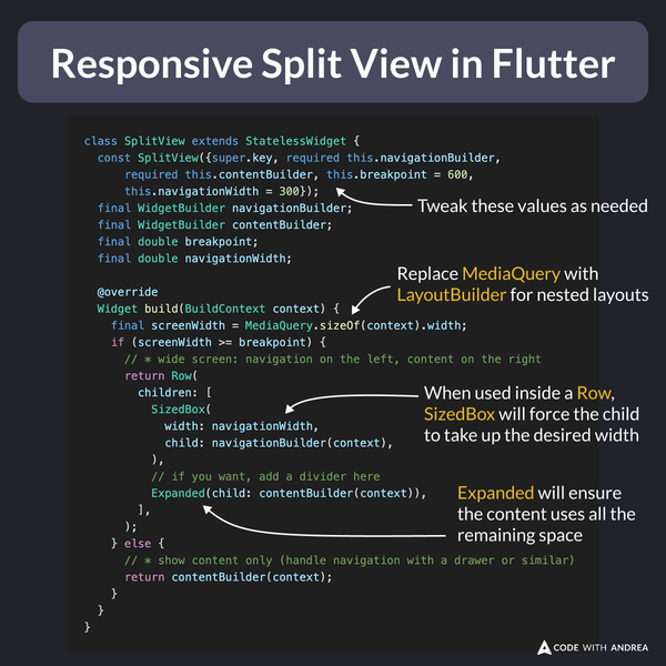
In Flutter, you can easily create a responsive split-view widget that works on mobile, desktop and web.
You can do this in 30 lines of code, without any 3rd party packages: 👇
Example Code
class SplitView extends StatelessWidget {
  const SplitView({super.key, required this.navigationBuilder,
      required this.contentBuilder, this.breakpoint = 600,
      this.navigationWidth = 300});
  final WidgetBuilder navigationBuilder;
  final WidgetBuilder contentBuilder;
  final double breakpoint;
  final double navigationWidth;

  @override
  Widget build(BuildContext context) {
    final screenWidth = MediaQuery.sizeOf(context).width;
    if (screenWidth >= breakpoint) {
      // * wide screen: navigation on the left, content on the right
      return Row(
        children: [
          SizedBox(
            width: navigationWidth,
            child: navigationBuilder(context),
          ),
          // if you want, add a divider here
          Expanded(child: contentBuilder(context)),
        ],
      );
    } else {
      // * show content only (handle navigation with a drawer or similar)
      return contentBuilder(context);
    }
  }
}
For a more complete tutorial, read this article (slightly outdated, but the main principles still apply):
Happy coding!