Flutter, as a multi-platform UI toolkit, allows you to build apps on apps on mobile, desktop, and web with a single codebase.
However, taking a mobile app layout and "stretching" it to a large screen never leads to a great user experience:

Instead, it's much better to use a responsive layout that makes the most of the available screen estate.
Depending on your intended visual hierarchy, you can mix and match many different techniques, widgets, and packages to make a Flutter app responsive.
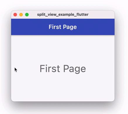
In this article, we'll focus on one very specific type of responsive layout and learn how to create a split view that looks like this on a widescreen:

and like this on mobile:

As we will see, this can be done by changing the top-level layout of your app when the window width crosses a certain threshold, using a so-called layout breakpoint.
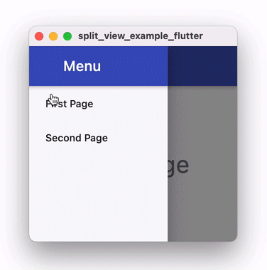
On mobile, the desired layout can be implemented with a navigation drawer containing a menu we can use to switch between different pages.
By default, we should be able to:
- open the drawer with the hamburger icon on the top-left corner (and close it with the back button).
- reveal or dismiss it with an interactive drag gesture from the left edge of the screen.
All this functionality is built-in inside the Flutter Drawer widget, we will use it on mobile.
But on large screens we can easily fit both the menu and content side by side, so we don't need a Drawer.
We won't use any 3rd party packages because there is no need to. Instead, we'll rely on built-in Flutter widgets such as
MediaQueryandDrawer.
So let's see what are the primary goals for this tutorial:
Goal #1: Reusable SplitView widget
We want to implement a custom SplitView widget that can be used in any app. As such, the widget API shouldn't make any assumptions about:
- what pages exist in the app
- what's inside the page selection menu
In other words, the SplitView widget should be reusable and take the menu and content widgets as arguments.
Goal #2: Page Selection with Riverpod
We want to enable page selection and switch between pages by selecting them from the menu.
To do this, we'll introduce some global application state and use the Riverpod package.
Goal #3: Drawer Navigation on Mobile
We want to enable drawer navigation so that the content page is always full-screen and we can open the menu on the side.
Along the way, we'll discover some interesting caveats about working with a hamburger menu with nested Scaffolds.
Ready? Let's go!
Starter Project
You can download the starter project from this page on GitHub and select the
starter-projectbranch.
Let's start with a simple app that contains a couple of pages to choose from, along with an AppMenu widget for choosing between them:

This is what the AppMenu looks like:
// app_menu.dart
import 'package:flutter/material.dart';
import 'package:split_view_example_flutter/first_page.dart';
import 'package:split_view_example_flutter/second_page.dart';

// a map of ("page name", WidgetBuilder) pairs
final _availablePages = <String, WidgetBuilder>{
  'First Page': (_) => FirstPage(),
  'Second Page': (_) => SecondPage(),
};

class AppMenu extends StatelessWidget {
  @override
  Widget build(BuildContext context) {
    return Scaffold(
      appBar: AppBar(title: Text('Menu')),
      body: ListView(
        // Note: use ListView.builder if there are many items
        children: <Widget>[
          // iterate through the keys to get the page names
          for (var pageName in _availablePages.keys)
            PageListTile(
              pageName: pageName,
            ),
        ],
      ),
    );
  }
}
The _availablePages variable is just a map of WidgetBuilders that we'll use to build either the FirstPage or SecondPage depending on what page is selected.
We also have a PageListTile widget that we can use to represent each of the items in the list:
class PageListTile extends StatelessWidget {
  const PageListTile({
    Key? key,
    this.selectedPageName,
    required this.pageName,
    this.onPressed,
  }) : super(key: key);
  final String? selectedPageName;
  final String pageName;
  final VoidCallback? onPressed;
  @override
  Widget build(BuildContext context) {
    return ListTile(
      // show a check icon if the page is currently selected
      // note: we use Opacity to ensure that all tiles have a leading widget
      // and all the titles are left-aligned
      leading: Opacity(
        opacity: selectedPageName == pageName ? 1.0 : 0.0,
        child: Icon(Icons.check),
      ),
      title: Text(pageName),
      onTap: onPressed,
    );
  }
}
This uses a ListTile widget with an onPressed callback that we can use to notify the parent widget when the tile is selected.
Note that
onPressedis declared as a nullableVoidCallback?property. See my ultimate guide to Dart Null Safety if you're not familiar with this syntax.
This is how the two content pages are implemented:
// first_page.dart

// Just a simple placeholder widget page
// (in a real app you'd have something more interesting)
class FirstPage extends StatelessWidget {
  @override
  Widget build(BuildContext context) {
    return Scaffold(
      appBar: AppBar(title: Text('First Page')),
      body: Center(
        child: Text('First Page', style: Theme.of(context).textTheme.headline4),
      ),
    );
  }
}
// SecondPage is identical, apart from the Text values
Inside main.dart, all we do is to return FirstPage as the home of the MaterialApp:
// main.dart
void main() {
  runApp(MyApp());
}

class MyApp extends StatelessWidget {
  @override
  Widget build(BuildContext context) {
    return MaterialApp(
      debugShowCheckedModeBanner: false,
      theme: ThemeData(
        primarySwatch: Colors.indigo,
      ),
      // just return `FirstPage` for now. We'll change this later
      home: FirstPage(),
    );
  }
}
Implementing the SplitView
As it stands, this app shows the FirstPage as a full-screen widget and doesn't have any page selection code yet.
So let's work out how to build this split view layout:

Let's create a simple SplitView widget with a single layout breakpoint:
// split_view.dart
import 'package:flutter/material.dart';
import 'package:split_view_example_flutter/app_menu.dart';
import 'package:split_view_example_flutter/first_page.dart';

class SplitView extends StatelessWidget {
  @override
  Widget build(BuildContext context) {
    final screenWidth = MediaQuery.of(context).size.width;
    const breakpoint = 600.0;
    if (screenWidth >= breakpoint) {
      // widescreen: menu on the left, content on the right
      return Row(
        children: [
          // use SizedBox to constrain the AppMenu to a fixed width
          SizedBox(
            width: 240,
            // TODO: make this configurable
            child: AppMenu(),
          ),
          // vertical black line as separator
          Container(width: 0.5, color: Colors.black),
          // use Expanded to take up the remaining horizontal space
          Expanded(
            // TODO: make this configurable
            child: FirstPage(),
          ),
        ],
      );
    } else {
      // narrow screen: show content, menu inside drawer
      return Scaffold(
        body: FirstPage(),
        // use SizedBox to contrain the AppMenu to a fixed width
        drawer: SizedBox(
          width: 240,
          child: Drawer(
            child: AppMenu(),
          ),
        ),
      );
    }
  }
}
This works by comparing the screen width obtained from MediaQuery with a constant breakpoint:
- If the screen width is greater than 600 points, we return a
Rowlayout with theAppMenuon the left and theFirstPageon the right. - Otherwise, we return a
Scaffoldwith theFirstPageas the body andDrawer(child: AppMenu())as the drawer.
In both cases, we wrap the AppMenu with a SizedBox of fixed width (240 points).
If you want the menu to have a width that is proportional to the screen width in split view mode, replace the
SizedBoxwith anExpandedwidget and tweak theflexvalues of bothExpandedwidgets.
If we pass a SplitView() as the home of MaterialApp() and run the app on desktop, we can already resize the window and see that the top-level layout changes when we cross the breakpoint value of 600 points.

Note: the
SplitViewwidget rebuilds when the window size changes. This is because we callMediaQuery.of(context)in thebuild()method. From the documentation of MediaQuery.of:
You can use this function to query the size and orientation of the screen, as well as other media parameters (see MediaQueryData for more examples). When that information changes, your widget will be scheduled to be rebuilt, keeping your widget up-to-date.
However, this widget is not reusable at all because:
- both the menu width and breakpoint are hard-coded
- both the content and menu widgets themselves are hard-coded
We can do better:
// split_view.dart
import 'package:flutter/material.dart';

class SplitView extends StatelessWidget {
  const SplitView({
    Key? key,
    // menu and content are now configurable
    required this.menu,
    required this.content,
    // these values are now configurable with sensible default values
    this.breakpoint = 600,
    this.menuWidth = 240,
  }) : super(key: key);
  final Widget menu;
  final Widget content;
  final double breakpoint;
  final double menuWidth;

  @override
  Widget build(BuildContext context) {
    final screenWidth = MediaQuery.of(context).size.width;
    if (screenWidth >= breakpoint) {
      // widescreen: menu on the left, content on the right
      return Row(
        children: [
          SizedBox(
            width: menuWidth,
            child: menu,
          ),
          Container(width: 0.5, color: Colors.black),
          Expanded(child: content),
        ],
      );
    } else {
      // narrow screen: show content, menu inside drawer
      return Scaffold(
        body: content,
        drawer: SizedBox(
          width: menuWidth,
          child: Drawer(
            child: menu,
          ),
        ),
      );
    }
  }
}
By introducing two Widget properties (menu and content), we let the parent widget decide what should go inside the SplitView. And the breakpoint and menuWidth are now configurable properties with sensible default values.
As a result, we can update the home argument of the MaterialApp:
MaterialApp(
  ...
  home: SplitView(
    menu: AppMenu(),
    content: FirstPage(),
  )
)
Much better.
For reference, this is a simplified diagram of the widget tree on widescreen:

And this is the equivalent on mobile:

As we can see, the mobile version has nested Scaffold widgets. We will get back to this later on when we tweak the drawer behaviour.
But before we get to that, we need to enable page selection.
Page Selection with Riverpod
Our app currently looks like this:
Note that there is no checkmark on any of the list items. And if we tap on the "Second Page" on the menu, nothing happens because we don't yet have a concept of currently selected page.
So how can we enable page selection?
Let's recall that we have defined this map of available pages:
// a map of ("page name", WidgetBuilder) pairs
final _availablePages = <String, WidgetBuilder>{
  'First Page': (_) => FirstPage(),
  'Second Page': (_) => SecondPage(),
};
The keys of this map represent the page names that we show on the menu.
So we can define a state variable for the selected page name, and use it to:
- show a checkmark next to the selected page inside the
AppMenu. - return the widget (
FirstPageorSecondPage) that corresponds to the selected page as the home of theMaterialApp.
This variable represents some global application state because both the AppMenu and the root widget (MyApp) need access to it.
So, how do we manage this global state, and how can widgets get access to it?
Any of the existing state management packages would do, or we could even use some of the built-in Flutter APIs such as ValueNotifier.
But for this tutorial, we're going to use Riverpod as it helps us easily handle both state management and dependency injection.
For more info about Riverpod, see my Riverpod Ultimate Guide.
To get this up and running, we can add the latest version to our pubspec.yaml:
dependencies:
  flutter:
    sdk: flutter
  flutter_riverpod: 1.0.0-dev.6
And we need to add a parent ProviderScope to our root widget:
void main() {
  runApp(ProviderScope(child: MyApp()));
}
Then, let's add a StateProvider to our app_menu.dart:
// this is a `StateProvider` so we can change its value
final selectedPageNameProvider = StateProvider<String>((ref) {
  // default value
  return _availablePages.keys.first;
});
As the name implies, this provider will give us access to the selected page name. By default, it returns the first key inside _availablePages.
We declared
selectedPageNameProvideras aStateProviderso that we can change its value. In this case, aStateNotifierProvideris not necessary because there's no business logic or backing store for this variable.
Reading the selected page
Let's update the AppMenu widget to use this:
// 1. extend from ConsumerWidget
class AppMenu extends ConsumerWidget {
  // 2. Add a WidgetRef argument
  @override
  Widget build(BuildContext context, WidgetRef ref) {
    // 3. watch the provider's state
    final selectedPageName = ref.watch(selectedPageNameProvider.state).state;
    return Scaffold(
      appBar: AppBar(title: Text('Menu')),
      body: ListView(
        children: <Widget>[
          for (var pageName in _availablePages.keys)
            PageListTile(
              // 4. pass the selectedPageName as an argument
              selectedPageName: selectedPageName,
              pageName: pageName,
            ),
        ],
      ),
    );
  }
}
In the build() method we use ref.watch to get the selected page name, and pass this as an argument to the PageListTile widget.
With this change, we now get the checkmark next to the first page in the list:
Updating the selected page
Next, let's enable page selection by adding an onPressed callback handler to our PageListTile:
PageListTile(
  selectedPageName: selectedPageName,
  pageName: pageName,
  onPressed: () => _selectPage(context, ref, pageName),
)
We can define the _selectPage method like so:
void _selectPage(BuildContext context, WidgetRef ref, String pageName) {
  // only change the state if we have selected a different page
  if (ref.read(selectedPageNameProvider.state).state != pageName) {
    ref.read(selectedPageNameProvider.state).state = pageName;
  }
}
With this change, we can now switch between the first and second page and the AppMenu widget rebuilds because we're using ref.watch to observe state changes in the build() method. As a result, the checkmark is also updated:

Updating the content page
However, the content page on the right-hand side still doesn't change because we're still passing a hard-coded FirstPage() to the SplitView inside MaterialApp.
To address that, let's define a new provider:
final selectedPageBuilderProvider = Provider<WidgetBuilder>((ref) {
  // watch for state changes inside selectedPageNameProvider
  final selectedPageKey = ref.watch(selectedPageNameProvider.state).state;
  // return the WidgetBuilder using the key as index
  return _availablePages[selectedPageKey]!;
});
This one is quite neat, because it watches for changes in the selectedPageNameProvider, and returns the corresponding WidgetBuilder from the _availablePages map.
Note how
selectedPageBuilderProvideris just a simpleProvider(not aStateProvider). But it still returns a new value whenever theselectedPageNameProvider's state changes.
Let's use it inside MyApp:
// 1. extend from ConsumerWidget
class MyApp extends ConsumerWidget {
  // 2. add a WidgetRef argument
  @override
  Widget build(BuildContext context, WidgetRef ref) {
    // 3. watch selectedPageBuilderProvider
    final selectedPageBuilder = ref.watch(selectedPageBuilderProvider);
    return MaterialApp(
      ...
      home: SplitView(
        menu: AppMenu(),
        // 4. use the WidgetBuilder
        content: selectedPageBuilder(context),
      ),
    );
  }
}
And if we test the app in split view mode now, everything works:

Drawer Navigation on Mobile
On the other hand, on mobile we still have some work to do.
In fact, we already can reveal the drawer by swiping it open from the left side of the screen:
But where is the hamburger menu icon? Shouldn't Flutter automatically add this for us?
After all, we have added a Drawer to the Scaffold inside the SplitView:
But the Scaffold inside the SplitView doesn't have an AppBar to show the hamburger icon.
And the Scaffold inside the FirstPage (or SecondPage) has an AppBar but doesn't have a Drawer.
Classic chicken and egg problem! 🐣
How can we solve it?
Well, here's how we could fix this on the FirstPage:
class FirstPage extends StatelessWidget {
  @override
  Widget build(BuildContext context) {
    // 1. look for an ancestor Scaffold
    final ancestorScaffold = Scaffold.maybeOf(context);
    // 2. check if it has a drawer
    final hasDrawer = ancestorScaffold != null && ancestorScaffold.hasDrawer;
    return Scaffold(
      appBar: AppBar(
        // 3. add a non-null leading argument if we have a drawer
        leading: hasDrawer
            ? IconButton(
                icon: Icon(Icons.menu),
                // 4. open the drawer if we have one
                onPressed:
                    hasDrawer ? () => ancestorScaffold!.openDrawer() : null,
              )
            : null,
        title: Text('First Page'),
      ),
      body: Center(
        child: Text('First Page', style: Theme.of(context).textTheme.headline4),
      ),
    );
  }
}
We can show the hamburger icon by adding a leading argument and use the onPressed callback to open the drawer of the ancestor Scaffold.
However, there is no guarantee that an ancestor Scaffold even exists (in fact we don't have one in split view mode). So we can use Scaffold.maybeOf(context) with some defensive code to account for this.
With these changes, we can run the app on mobile, see the hamburger menu, and use it to open the drawer.

But we don't want to copy-paste all this new code for each new page that we add.
Instead, let's create a reusable PageScaffold widget:
class PageScaffold extends StatelessWidget {
  const PageScaffold({
    Key? key,
    required this.title,
    this.actions = const [],
    this.body,
    this.floatingActionButton,
  }) : super(key: key);
  final String title;
  final List<Widget> actions;
  final Widget? body;
  final Widget? floatingActionButton;

  @override
  Widget build(BuildContext context) {
    // 1. look for an ancestor Scaffold
    final ancestorScaffold = Scaffold.maybeOf(context);
    // 2. check if it has a drawer
    final hasDrawer = ancestorScaffold != null && ancestorScaffold.hasDrawer;
    return Scaffold(
      appBar: AppBar(
        // 3. add a non-null leading argument if we have a drawer
        leading: hasDrawer
            ? IconButton(
                icon: Icon(Icons.menu),
                // 4. open the drawer if we have one
                onPressed:
                    hasDrawer ? () => ancestorScaffold!.openDrawer() : null,
              )
            : null,
        title: Text(title),
        actions: actions,
      ),
      body: body,
      floatingActionButton: floatingActionButton,
    );
  }
}
Now that we have this, we can simplify our FirstPage and SecondPage widgets:
import 'package:flutter/material.dart';
import 'package:split_view_example_flutter/page_scaffold.dart';

class FirstPage extends StatelessWidget {
  @override
  Widget build(BuildContext context) {
    return PageScaffold(
      title: 'First Page',
      body: Center(
        child: Text('First Page', style: Theme.of(context).textTheme.headline4),
      ),
    );
  }
}
// same for SecondPage
Much better.
We have only one thing left to do!
Dismissing the drawer when a new page is selected
Let's recall the _selectPage method inside our AppMenu:
void _selectPage(BuildContext context, WidgetRef ref, String pageName) {
  // only change the state if we have selected a different page
  if (ref.read(selectedPageNameProvider.state).state != pageName) {
    ref.read(selectedPageNameProvider.state).state = pageName;
  }
}
This ensures that the content page is updated when we select a new page.
But it doesn't dismiss the drawer automatically. Let's fix this:
void _selectPage(BuildContext context, WidgetRef ref, String pageName) {
  // only change the state if we have selected a different page
  if (ref.read(selectedPageNameProvider.state).state != pageName) {
    ref.read(selectedPageNameProvider.state).state = pageName;
    // dismiss the drawer of the ancestor Scaffold if we have one
    if (Scaffold.maybeOf(context)?.hasDrawer ?? false) {
      Navigator.of(context).pop();
    }
  }
}
All done! If we try the app now, all the drawer-based navigation works as expected.
Wrap Up
Split view is a useful UX pattern that makes good use of the available screen space on bigger form factors.
But we need to ensure that drawer-based navigation still works as expected on mobile, and pay attention to details when working with nested Scaffolds.
The SplitView and PageScaffold widgets we have created are portable, and you should be able to use them "as-is" on your projects or tweak them as needed.
You can find the completed project for this tutorial on GitHub.
And if you end up using this in your projects, share your feedback on Twitter.
Where to go from here?
Adding a split view with a single layout breakpoint is a good step towards making your app responsive.
And in addition to what we have covered, Flutter offers many useful responsive layout widgets that can help you out:
- MediaQuery
- LayoutBuilder
- OrientationBuilder
- Expanded and Flexible
- FractionallySizedBox
- FittedBox
- AspectRatio
For apps with more complex layouts, consider adding multiple layout breakpoints, and even have more than two horizontal sections on large screens:

Once you tackle complex responsive layouts, then it becomes advisable to look for packages that can do some of the heavy lifting for you. Here are a couple of good ones:
So go ahead my friend, and make your apps responsive! 🚀
Happy coding!


