Whenever you want to lay out items in a grid, the Flutter GridView widget is the first place to go.
GridView offers these properties to decide how items are laid out:
- crossAxisSpacing
- mainAxisSpacing
- crossAxisCount (when using
GridView.countorSliverGridDelegateWithFixedCrossAxisCount) - maxCrossAxisExtent (when using
GridView.extentorSliverGridDelegateWithMaxCrossAxisExtent) - childAspectRatio
Depending on what we're after, we can choose how many items we want on the cross axis (with crossAxisCount), or the maximum cross-axis extent (with maxCrossAxisExtent).
In addition to this, childAspectRatio may be used to specify the width / height ratio of all the items in the grid.
Note:
childAspectRatioapplies the same ratio to all items in the grid, regardless of the size of the content inside them.
This works well for simple layouts.
But it quickly becomes clear that GridView is not flexible enough to represent complex, responsive layouts.
So in this article, we'll explore the limitations of the Flutter GridView widget.
And we'll learn how to build a responsive grid widget with content-sized items using the flutter_layout_grid package, which is based on the CSS Grid Layout spec.
But let's start with GridView and understand its limitations.
What's wrong with GridView?
To illustrate this, let's consider this example:
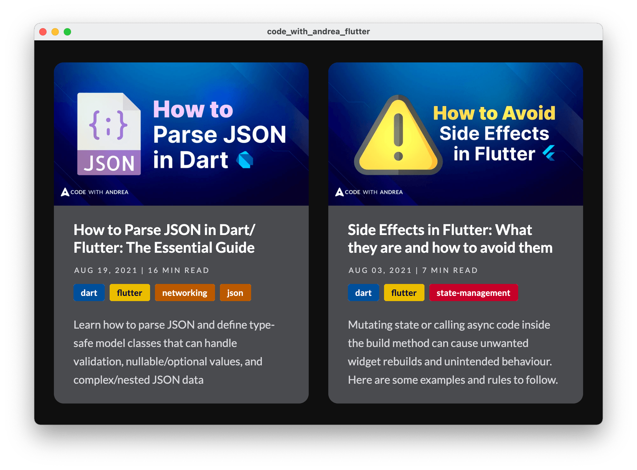
If the window above has a fixed width, we can tweak all the required properties and get the items to render correctly.
Here's a custom widget that renders the layout above using GridView:
class ItemCardGridView extends StatelessWidget {
  const ItemCardGridView(
      {Key? key,
      required this.crossAxisCount,
      required this.padding,
      required this.items})
      // we plan to use this with 1 or 2 columns only
      : assert(crossAxisCount == 1 || crossAxisCount == 2),
        super(key: key);
  final int crossAxisCount;
  final EdgeInsets padding;
  // list representing the data for all items
  final List<ItemCardData> items;

  @override
  Widget build(BuildContext context) {
    return GridView.builder(
      padding: padding,
      gridDelegate: SliverGridDelegateWithFixedCrossAxisCount(
        crossAxisCount: crossAxisCount,
        mainAxisSpacing: 40,
        crossAxisSpacing: 24,
        // width / height: fixed for *all* items
        childAspectRatio: 0.75,
      ),
      // return a custom ItemCard
      itemBuilder: (context, i) => ItemCard(data: items[i]),
      itemCount: items.length,
    );
  }
}
So far, nothing surprising. We use a GridView.builder to create ItemCard widgets and define all the layout properties with SliverGridDelegateWithFixedCrossAxisCount.
What is complex here is the ItemCard widget, which contains:
- a banner image
- a title
- some metadata
- some tags
- a description
Since these values change based on the content, we get some problems if we apply the same childAspectRatio to all grid items.
As proof of this, here's what happens when we resize the window:
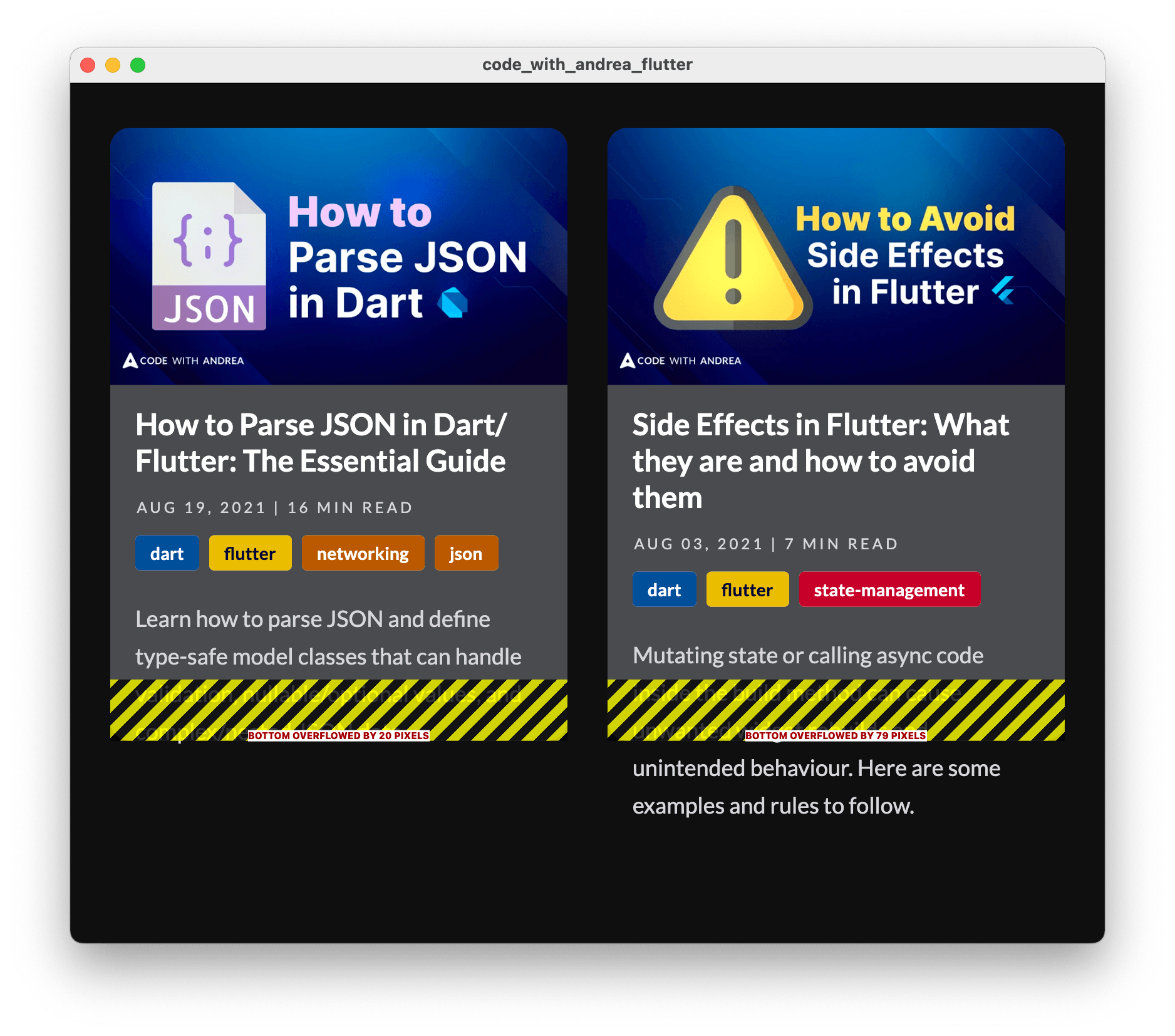
And if we try to make our app responsive and switch to a single-column layout when the window gets smaller, this is what we get:

Bottom line: using a fixed aspect ratio is a no-go because:
- if the item width becomes too small, we'll get a bottom overflow
- if the item width becomes too big, we'll get extra empty space at the bottom
No matter how hard we try, we can't tweak all the GridView properties and make them work for all window sizes.
We need a different layout algorithm
What we really need is a layout algorithm that can work out how tall each item should be as the width changes.
More specifically, the algorithm should calculate the height of the tallest item on each row, and apply that to all items in the row. This means that the size of any given item on the grid depends on the size of other items in the grid.
This is not possible with GridView. And it can't be done with a Stack either.
To accomplish this in Flutter, we need to use a rather esoteric widget called MultiChildRenderObjectWidget.
I'll be honest: things can get quite complex if we try to implement our own custom layout using MultiChildRenderObjectWidget. If you're curious about all the details, you can read this excellent page on StackOverflow:
But that's not what we'll do here. Instead, we'll use a package called flutter_layout_grid that supports content-sized items out-of-the-box.
Content-sized items with the flutter_layout_grid package
The package README describes this as a powerful grid layout system for Flutter, optimized for complex user interface design.
So let's use this!
First of all, we need to add it to our pubspec.yaml:
dependencies:
  flutter_layout_grid: ^1.0.3
Then, we can define a custom ItemCardLayoutGrid widget to show each ItemCard inside a LayoutGrid widget:
import 'package:flutter_layout_grid/flutter_layout_grid.dart';

class ItemCardLayoutGrid extends StatelessWidget {
  const ItemCardLayoutGrid({
    Key? key,
    required this.crossAxisCount,
    required this.items,
  })
  // we only plan to use this with 1 or 2 columns
  : assert(crossAxisCount == 1 || crossAxisCount == 2),
    // assume we pass an list of 4 items for simplicity
    assert(items.length == 4),
    super(key: key);
  final int crossAxisCount;
  final List<ItemCardData> items;

  @override
  Widget build(BuildContext context) {
    return LayoutGrid(
      // set some flexible track sizes based on the crossAxisCount
      columnSizes: crossAxisCount == 2 ? [1.fr, 1.fr] : [1.fr],
      // set all the row sizes to auto (self-sizing height)
      rowSizes: crossAxisCount == 2
          ? const [auto, auto]
          : const [auto, auto, auto, auto],
      rowGap: 40, // equivalent to mainAxisSpacing
      columnGap: 24, // equivalent to crossAxisSpacing
      // note: there's no childAspectRatio
      children: [
        // render all the cards with *automatic child placement*
        for (var i = 0; i < items.length; i++)
          ItemCard(data: items[i]),
      ],
    );
  }
}
Here's how things work.
First of all, we define the columnSizes:
// set some flexible track sizes based on the crossAxisCount
columnSizes: crossAxisCount == 2 ? [1.fr, 1.fr] : [1.fr]
This uses a FlexibleTrackSize unit to define how columns should size themselves. 1.fr is the same as setting flex: 1 inside a Flexible widget.
Then, we define the rowSizes:
// set all the row sizes to auto (self-sizing height)
// here we assume there will be 4 items in total
rowSizes: crossAxisCount == 2
    ? const [auto, auto]
    : const [auto, auto, auto, auto]
In this case, we use auto because we want the rows to size themselves based on the content.
Note: The code above uses the ternary operator to render a 2x2 or 1x4 grid depending on the
crossAxisCount, so that we pass a list with the correct number of values to thecolumnSizesandrowSizesarguments.
After that, we set the rowGap and columnGap properties, which are equivalent to mainAxisSpacing and crossAxisSpacing:
rowGap: 40, // equivalent to mainAxisSpacing
columnGap: 24, // equivalent to crossAxisSpacing
And finally, we pass a list of children inside a loop (our ItemCard widgets):
children: [
  // render all the cards with *automatic child placement*
  for (var i = 0; i < items.length; i++)
    ItemCard(data: items[i]),
]
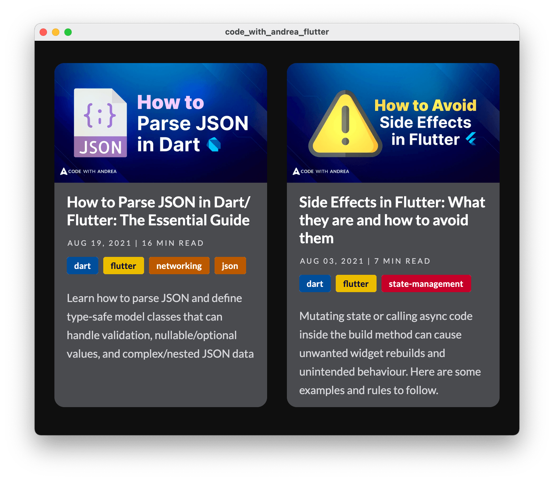
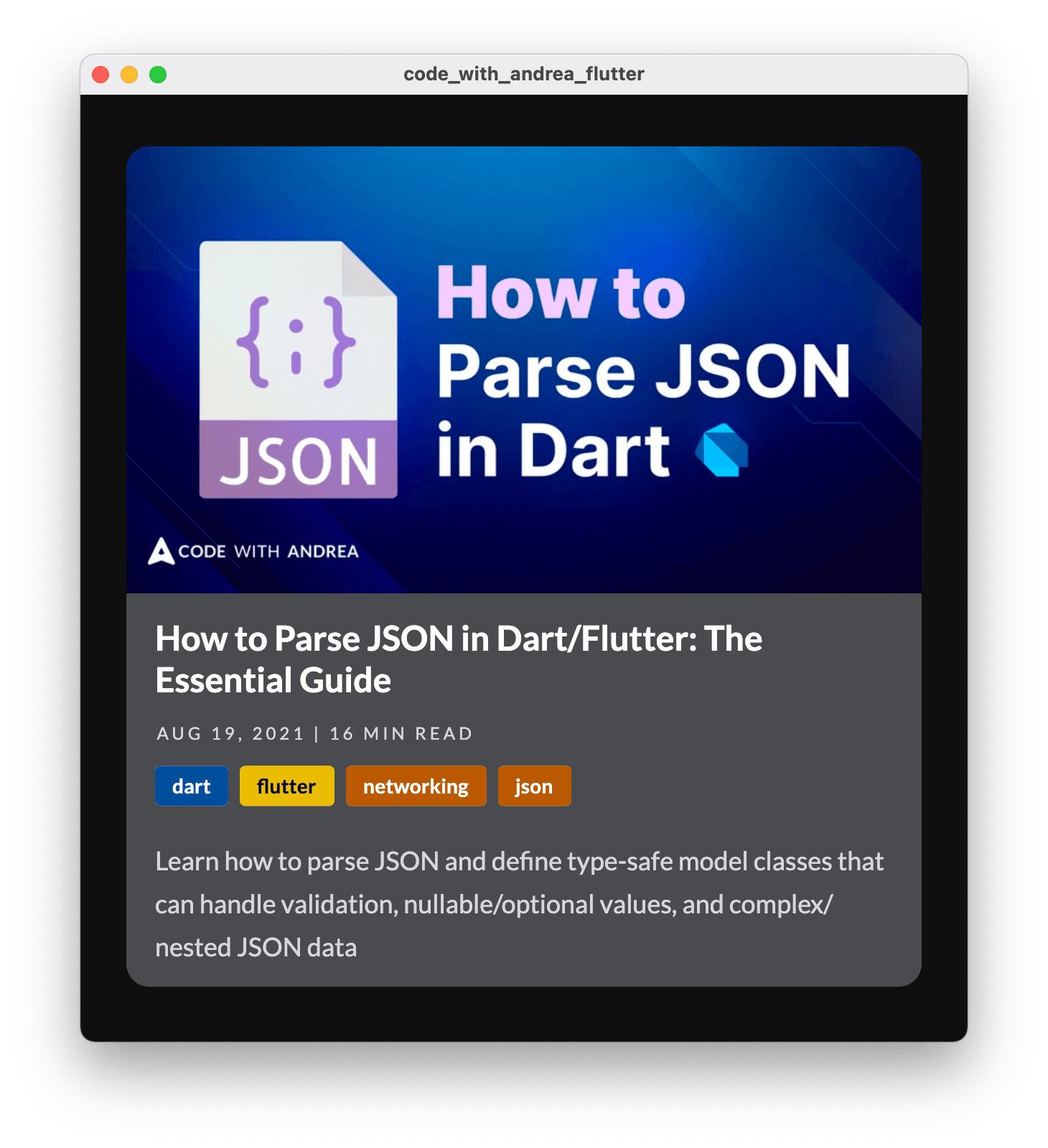
That's it! If we swap our previous implementation with our new ItemCardLayoutGrid widget, we get content-sized items irrespective of window size:
Using LayoutGrid with Slivers
Grid layouts are rarely used on their own and you're likely to show them alongside other scrollable content.
This is what slivers are for and Flutter offers a SliverGrid widget that we can place inside a CustomScrollView (as a replacement for GridView).
However, LayoutGrid doesn't have a "sliver-compatible" replacement.
So if you intend to use it inside a CustomScrollView, make sure to wrap it inside a SliverToBoxAdapter:
child: CustomScrollView(
  slivers: [
    // some slivers
    SliverToBoxAdapter(child: LayoutGrid(...)),
    // other slivers
  ]
)
To learn more about slivers, see my video about SliverGrid, SliverToBoxAdapter, and other sliver widgets.
Conclusion
That's it! By replacing GridView with LayoutGrid and setting all the rowSizes to auto, we can get content-sized items that work with a completely responsive layout, without the limitations of a fixed child aspect ratio.
For a complete demo showcasing all the code we have covered, see this project on GitHub:
This shows a complete home page with multiple sections inside a CustomScrollView.
There is much more to flutter_layout_grid than what we have covered here, so make sure to check the documentation to learn about all the other features:
References
While researching this article, I found the following resources useful:
- How to use CustomMultiChildLayout & CustomSingleChildLayout in Flutter | StackOverflow
- How to get height of a Widget? | StackOverflow
- How to get a height of a widget? | GitHub
- Get dimensions of widget after layout without render | GitHub
Happy coding!


