Today we'll see how to add a FloatingActionButton (FAB) with options to a BottomAppBar in Flutter. And we'll build this UI:
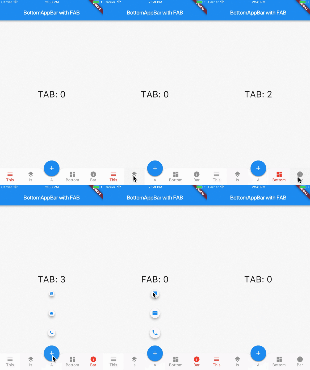
Our specific goal here is to have a custom BottomAppBar that behaves in the same way as BottomNavigationBar. That is, there are multiple tabs with exactly one selected tab at any given time.
You may wonder, why not using BottomNavigationBar directly?
While it is technically possible to "dock" a FloatingActionButton to a BottomNavigationBar, this does not work very well in practice. More on this below.
For now, let's see how we can achieve the desired look and feel with BottomAppBar.
Adding a centered FAB
After creating a new Flutter project, we get the default sample app. This already includes a FloatingActionButton for incrementing a counter.
We can add a BottomAppBar to our Scaffold.bottomNavigationBar like so:
return Scaffold(
  appBar: AppBar(
    title: Text(widget.title),
  ),
  floatingActionButtonLocation: FloatingActionButtonLocation.centerDocked,
  floatingActionButton: FloatingActionButton(
    onPressed: () { },
    tooltip: 'Increment',
    child: Icon(Icons.add),
    elevation: 2.0,
  ),
  bottomNavigationBar: BottomAppBar(
    child: Row(
      mainAxisSize: MainAxisSize.max,
      mainAxisAlignment: MainAxisAlignment.spaceBetween,
      children: <Widget>[],
    ),
    notchedShape: CircularNotchedRectangle(),
    color: Colors.blueGrey,
  ),
);
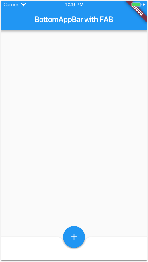
Note how we set Scaffold.floatingActionButtonLocation to FloatingActionButtonLocation.centerDocked to "dock" our FAB to the middle of our BottomAppBar.
Also we set notchedShape: CircularNotchedRectangle() to add a nice notched shape in the BottomAppBar below the FAB.
If we run the app at this stage, this is what we get:
Adding tabs with Navigation
In addition to our FAB, we want to add tabs so that we can view different pages in our app.
To do this, we can create a custom FABBottomAppBar to take care of the following:
- show either 2 or 4 tabs (our design is symmetrical).
- highlight and keep track of the currently selected tab.
- fire a callback each time a tab is selected, so that the parent can update the current page.
So how would a minimal API look like for our FABBottomAppBar? Let's see:
class FABBottomAppBarItem {
  FABBottomAppBarItem({this.iconData, this.text});
  IconData iconData;
  String text;
}

class FABBottomAppBar extends StatefulWidget {
  final List<FABBottomAppBarItem> items;
  final ValueChanged<int> onTabSelected;

  @override
  State<StatefulWidget> createState() => FABBottomAppBarState();
}

class FABBottomAppBarState extends State<FABBottomAppBar> {
  int _selectedIndex = 0;

  _updateIndex(int index) {
    widget.onTabSelected(index);
    setState(() {
      _selectedIndex = index;
    });
  }

  // TODO: build method here
}
First, we define a FABBottomAppBarItem class to contain an IconData and a String. This represents a single tab item.
Then, we create a FABBottomAppBar widget. This needs to specify a list of items and a callback (onTabSelected).
FABBottomAppBar itself is a StatefulWidget, since it needs to keep track of the selected tab and update its appearance accordingly.
In the FABBottomAppBarState class, we define a _selectedIndex, which is updated when we call _updateIndex.
Next, we need to define the build method, where we add all the items:
@override
Widget build(BuildContext context) {
  List<Widget> items = List.generate(widget.items.length, (int index) {
    return _buildTabItem(
      item: widget.items[index],
      index: index,
      onPressed: _updateIndex,
    );
  });

  return BottomAppBar(
    child: Row(
      mainAxisSize: MainAxisSize.max,
      mainAxisAlignment: MainAxisAlignment.spaceAround,
      children: items,
    ),
  );
}
A few notes:
- Lines 3 to 9: here we use a list generator to create the tab items, passing in the correct item, index and width.
- Lines 11 to 17: we create a
BottomAppBarcontaining aRowwith the items we have defined. We useMainAxisSize.maxandMainAxisAlignment.spaceAroundto ensure that the full width is used and the items are equally spaced.
Then, we implement the _buildTabItem method. Here it is:
Widget _buildTabItem({
  FABBottomAppBarItem item,
  int index,
  ValueChanged<int> onPressed,
}) {
  Color color = _selectedIndex == index ? widget.selectedColor : widget.color;
  return Expanded(
    child: SizedBox(
      height: widget.height,
      child: Material(
        type: MaterialType.transparency,
        child: InkWell(
          onTap: () => onPressed(index),
          child: Column(
            mainAxisSize: MainAxisSize.min,
            mainAxisAlignment: MainAxisAlignment.center,
            children: <Widget>[
              Icon(item.iconData, color: color, size: widget.iconSize),
              Text(
                item.text,
                style: TextStyle(color: color),
              )
            ],
          ),
        ),
      ),
    ),
  );
}
On line 6 we check if the selected index matches the current tab index, and we choose the active/inactive color accordingly.
On lines 13 to 26 we define an InkWell wrapped inside a Material widget. This gives us an onTap gesture recognizer and provides a material splash effect when the widget is tapped.
The child of our InkWell is a Column which contains an Icon and Text, both configured with the data from the input FABBottomAppBarItem.
The whole result is wrapped inside an Expanded widget. This guarantees that each item has the same width inside the parent Row.
We can test the FABBottomAppBar we created by using it as the bottomNavigationBar of our Scaffold, and providing four items:
bottomNavigationBar: FABBottomAppBar(
  onTabSelected: _selectedTab,
  items: [
    FABBottomAppBarItem(iconData: Icons.menu, text: 'This'),
    FABBottomAppBarItem(iconData: Icons.layers, text: 'Is'),
    FABBottomAppBarItem(iconData: Icons.dashboard, text: 'Bottom'),
    FABBottomAppBarItem(iconData: Icons.info, text: 'Bar'),
  ],
),
Here is the result:
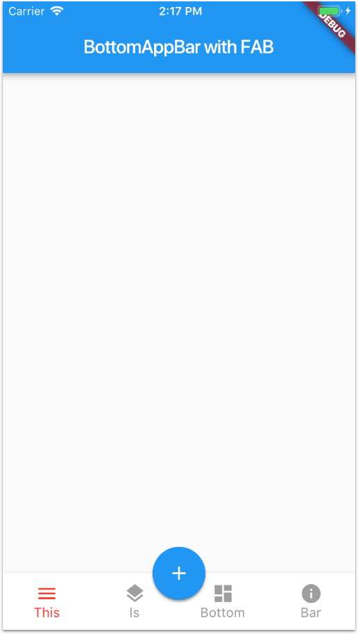
We can now switch tabs, and get a callback each time we do so.
Sweating the details
Encouraging progress so far. But there are a few things that we could improve to make our FABBottomAppBar more "production-ready".
In the example code above, we have hard-coded the following things:
BottomAppBar:height,backgroundColorandnotchedShape- Icon size
- Active / inactive tab color
In addition, the middle tab icons feel a bit too close to the FAB itself. It would be good to add some spacing in the middle.
Even better, why not add a small optional text caption just below the FAB, baseline-aligned with the text of the tabs?
Let's address all these concerns in one go. Here is the final code for our FABBottomAppBar:
import 'package:flutter/material.dart';

class FABBottomAppBarItem {
  FABBottomAppBarItem({this.iconData, this.text});
  IconData iconData;
  String text;
}

class FABBottomAppBar extends StatefulWidget {
  FABBottomAppBar({
    this.items,
    this.centerItemText,
    this.height: 60.0,
    this.iconSize: 24.0,
    this.backgroundColor,
    this.color,
    this.selectedColor,
    this.notchedShape,
    this.onTabSelected,
  }) {
    assert(this.items.length == 2 || this.items.length == 4);
  }
  final List<FABBottomAppBarItem> items;
  final String centerItemText;
  final double height;
  final double iconSize;
  final Color backgroundColor;
  final Color color;
  final Color selectedColor;
  final NotchedShape notchedShape;
  final ValueChanged<int> onTabSelected;

  @override
  State<StatefulWidget> createState() => FABBottomAppBarState();
}

class FABBottomAppBarState extends State<FABBottomAppBar> {
  int _selectedIndex = 0;

  _updateIndex(int index) {
    widget.onTabSelected(index);
    setState(() {
      _selectedIndex = index;
    });
  }

  @override
  Widget build(BuildContext context) {
    List<Widget> items = List.generate(widget.items.length, (int index) {
      return _buildTabItem(
        item: widget.items[index],
        index: index,
        onPressed: _updateIndex,
      );
    });
    items.insert(items.length >> 1, _buildMiddleTabItem());

    return BottomAppBar(
      shape: widget.notchedShape,
      child: Row(
        mainAxisSize: MainAxisSize.max,
        mainAxisAlignment: MainAxisAlignment.spaceAround,
        children: items,
      ),
      color: widget.backgroundColor,
    );
  }

  Widget _buildMiddleTabItem() {
    return Expanded(
      child: SizedBox(
        height: widget.height,
        child: Column(
          mainAxisSize: MainAxisSize.min,
          mainAxisAlignment: MainAxisAlignment.center,
          children: <Widget>[
            SizedBox(height: widget.iconSize),
            Text(
              widget.centerItemText ?? '',
              style: TextStyle(color: widget.color),
            ),
          ],
        ),
      ),
    );
  }

  Widget _buildTabItem({
    FABBottomAppBarItem item,
    int index,
    ValueChanged<int> onPressed,
  }) {
    Color color = _selectedIndex == index ? widget.selectedColor : widget.color;
    return Expanded(
      child: SizedBox(
        height: widget.height,
        child: Material(
          type: MaterialType.transparency,
          child: InkWell(
            onTap: () => onPressed(index),
            child: Column(
              mainAxisSize: MainAxisSize.min,
              mainAxisAlignment: MainAxisAlignment.center,
              children: <Widget>[
                Icon(item.iconData, color: color, size: widget.iconSize),
                Text(
                  item.text,
                  style: TextStyle(color: color),
                )
              ],
            ),
          ),
        ),
      ),
    );
  }
}
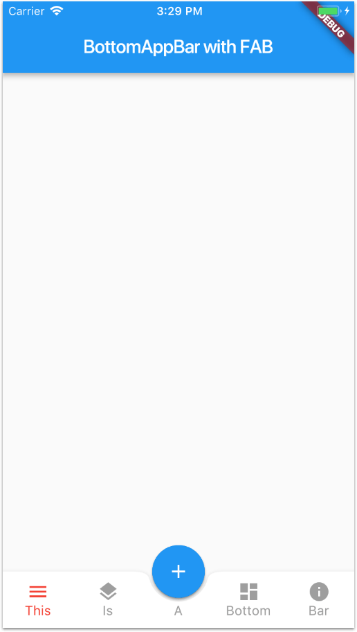
Note how now we can specify a centerItemText, which will be positioned just below the FAB. If this is empty or null, we render an empty Text.
Here is the final result:
What about BottomNavigationBar?
I have tried docking the FAB inside a BottomNavigationBar, but I have found some limitations:
- There is no way of adding a placeholder or empty text under the FAB, other than creating a
BottomNavigationBarItem. This is not desirable asBottomNavigationBarItemis a tab in its own right and can be tapped. BottomNavigationBardoesn't supportnotchedShape.
Using BottomAppBar requires more code but is more flexible as it uses a Row under the hood, and this can be configured as we please.
By the way, if you want to learn more about BottomNavigationBar and how to use it to enable multiple independent Navigators, make sure to read my previous article:
Full source code
I open sourced my full example here on GitHub. 🙏
Feel free to reuse it in your projects. 😎
Revealing options when the FAB is tapped
This is covered on the next article:
Happy coding!

