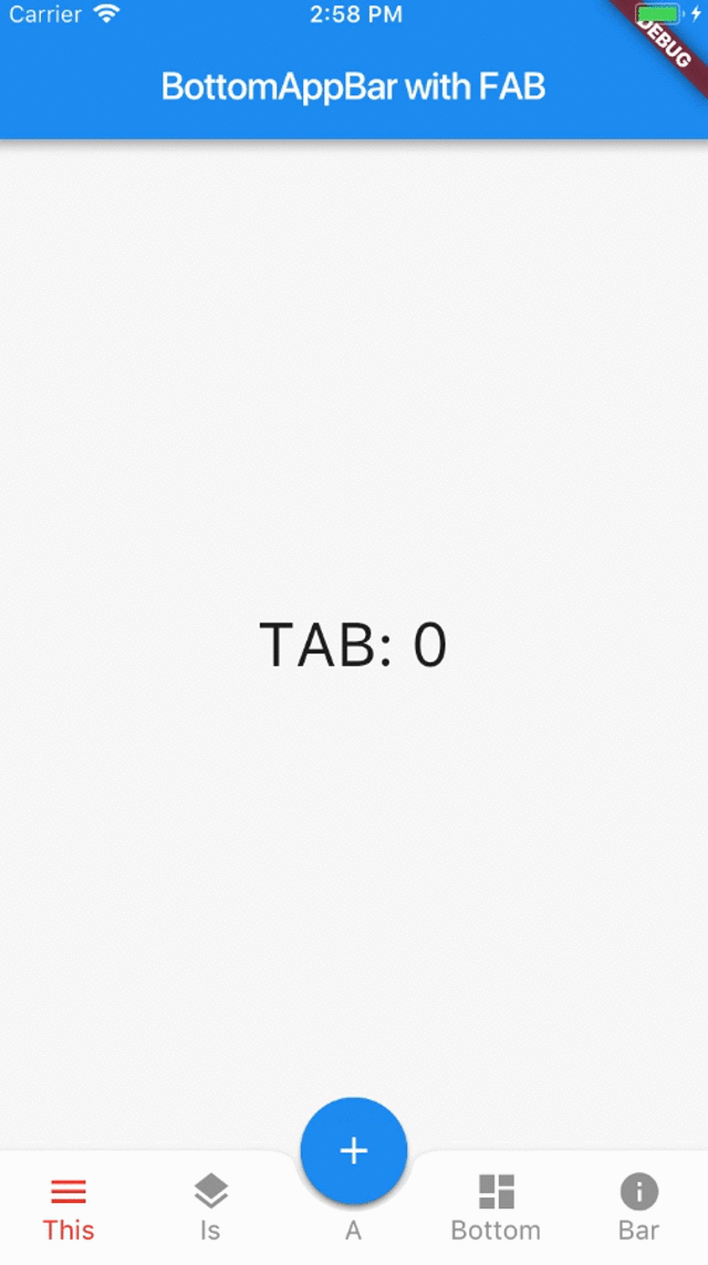
This is the second part of my tutorial about BottomAppBar and FAB (part one is here). Today we will see how to reveal options when the FAB if pressed.
We will see how to add overlays in Flutter, and why this is a valuable technique that you can add to your toolbox.
Revealing buttons when the FAB is pressed
In this tutorial we will add the code to enable the following animation:
The animation itself was originally taken from this example on StackOverflow.
I have bundled the example code into FabWithIcons, a new custom widget that we can assign directly to our Scaffold.floatingActionButton:
import 'package:flutter/material.dart';

// https://stackoverflow.com/questions/46480221/flutter-floating-action-button-with-speed-dail
class FabWithIcons extends StatefulWidget {
  FabWithIcons({this.icons, this.onIconTapped});
  final List<IconData> icons;
  ValueChanged<int> onIconTapped;
  @override
  State createState() => FabWithIconsState();
}

class FabWithIconsState extends State<FabWithIcons> with TickerProviderStateMixin {
  AnimationController _controller;

  @override
  void initState() {
    super.initState();
    _controller = AnimationController(
      vsync: this,
      duration: const Duration(milliseconds: 250),
    );
  }

  @override
  Widget build(BuildContext context) {
    return Column(
      mainAxisAlignment: MainAxisAlignment.center,
      mainAxisSize: MainAxisSize.min,
      children: List.generate(widget.icons.length, (int index) {
        return _buildChild(index);
      }).toList()..add(
        _buildFab(),
      ),
    );
  }

  Widget _buildChild(int index) {
    Color backgroundColor = Theme.of(context).cardColor;
    Color foregroundColor = Theme.of(context).accentColor;
    return Container(
      height: 70.0,
      width: 56.0,
      alignment: FractionalOffset.topCenter,
      child: ScaleTransition(
        scale: CurvedAnimation(
          parent: _controller,
          curve: Interval(
              0.0,
              1.0 - index / widget.icons.length / 2.0,
              curve: Curves.easeOut
          ),
        ),
        child: FloatingActionButton(
          backgroundColor: backgroundColor,
          mini: true,
          child: Icon(widget.icons[index], color: foregroundColor),
          onPressed: () => _onTapped(index),
        ),
      ),
    );
  }

  Widget _buildFab() {
    return FloatingActionButton(
      onPressed: () {
        if (_controller.isDismissed) {
          _controller.forward();
        } else {
          _controller.reverse();
        }
      },
      tooltip: 'Increment',
      child: Icon(Icons.add),
      elevation: 2.0,
    );
  }

  void _onTapped(int index) {
    _controller.reverse();
    widget.onIconTapped(index);
  }
}
How does this work?
- Line 4: We define
FabWithIconsas aStatefulWidgetas it needs anAnimationControllerto manage the animation state. - Lines 5 to 7: We pass a list of icons and a callback for when an icon is tapped. This is of type
ValueChanged<int>so that we can specify the index of the icon that was tapped. - Lines 12 to 22: We add a
TickerProviderStateMixinto our state class, and initialise anAnimationController, passingthisto thevsyncparameter. For a good overview of the animation APIs see this article about Flutter animations by Sergi & Replace. - Lines 25 to 35: In our
buildmethod, we generate a list of icons, and append aFloatingActionButtonas the last element. - Lines 37 to 61: We define a small (
mini: true)FloatingActionButtonfor the item at a given index, and link aScaleTransitionwidget to our animation controller. This is what makes the FABs animate in and out. - Lines 63 to 76: We create the main FAB, and use the
onPressedhandler to update our animation controller as needed. - Lines 78 to 81: When an option is selected, we hide all the icons (via
_controller.reverse()), and notify the parent that an item has been selected.
Let's try to use this.
In our main page, we add this method to create a FAB with three icons:
Widget _buildFab(BuildContext context) {
  final icons = [ Icons.sms, Icons.mail, Icons.phone ];
  return FabWithIcons(
    icons: icons,
    onIconTapped: (index) {},
  );
}
Then, we can call it like so inside our Scaffold:
floatingActionButton: _buildFab(context)
If we run the app, we see that this does not look right. However, if we comment out the floatingActionButtonLocation line in our Scaffold, the FAB moves to the default location and no longer interferes with our BottomAppBar.

What is going on here?
Well, our FABWithIcons is taller than a normal FAB because it has additional icons. Trying to fit this as a docked item in a BottomAppBar does not work well. I suspect the Flutter SDK tries to compensate for the extra height by pushing the FAB all the way to the bottom, but this results in a visual artifact.
What to do?
Enter Overlays
What if we could use a standard FAB as a single widget in our BottomAppBar, but switch to a completely separate layer when we need to show the extra icons?
Flutter offers a widget called Overlay which is great for this scenario. From the documentation of the Overlay class:
A Stack of entries that can be managed independently. Overlays let independent child widgets "float" visual elements on top of other widgets by inserting them into the overlay's Stack. The overlay lets each of these widgets manage their participation in the overlay using
OverlayEntryobjects.
This sounds like what we need. But how do we use it?
The SDK documentation reveals that we need to create an OverlayEntry object so that we can hold our custom FABWithIcons. We can do this by defining this method:
void addToOverlay(OverlayEntry entry) async {
  Overlay.of(context).insert(entry);
}
However, this is some imperative code, while our application UI is defined declaratively. How do we reconcile the two?
It turns out that getting overlays to work requires quite a bit of work, and implementing them correctly is not straightforward.
Luckily, Matt Carroll has already explored this issue in his Fluttery video about Feature Discovery, and created some useful layout helper widgets.
For the purposes of our tutorial, we are going to borrow and use some of his code. Here is the entire Overlay layout code:
// code from: https://github.com/matthew-carroll/flutter_ui_challenge_feature_discovery
// TODO: Use https://github.com/matthew-carroll/fluttery/blob/master/lib/src/layout_overlays.dart
import 'package:flutter/material.dart';

class AnchoredOverlay extends StatelessWidget {
  final bool showOverlay;
  final Widget Function(BuildContext, Offset anchor) overlayBuilder;
  final Widget child;

  AnchoredOverlay({
    this.showOverlay,
    this.overlayBuilder,
    this.child,
  });

  @override
  Widget build(BuildContext context) {
    return new Container(
      child: new LayoutBuilder(builder: (BuildContext context, BoxConstraints constraints) {
        return new OverlayBuilder(
          showOverlay: showOverlay,
          overlayBuilder: (BuildContext overlayContext) {
            RenderBox box = context.findRenderObject() as RenderBox;
            final center = box.size.center(box.localToGlobal(const Offset(0.0, 0.0)));
            return overlayBuilder(overlayContext, center);
          },
          child: child,
        );
      }),
    );
  }
}

class OverlayBuilder extends StatefulWidget {
  final bool showOverlay;
  final Function(BuildContext) overlayBuilder;
  final Widget child;

  OverlayBuilder({
    this.showOverlay = false,
    this.overlayBuilder,
    this.child,
  });

  @override
  _OverlayBuilderState createState() => new _OverlayBuilderState();
}

class _OverlayBuilderState extends State<OverlayBuilder> {
  OverlayEntry overlayEntry;

  @override
  void initState() {
    super.initState();

    if (widget.showOverlay) {
      WidgetsBinding.instance.addPostFrameCallback((_) => showOverlay());
    }
  }

  @override
  void didUpdateWidget(OverlayBuilder oldWidget) {
    super.didUpdateWidget(oldWidget);
    WidgetsBinding.instance.addPostFrameCallback((_) => syncWidgetAndOverlay());
  }

  @override
  void reassemble() {
    super.reassemble();
    WidgetsBinding.instance.addPostFrameCallback((_) => syncWidgetAndOverlay());
  }

  @override
  void dispose() {
    if (isShowingOverlay()) {
      hideOverlay();
    }

    super.dispose();
  }

  bool isShowingOverlay() => overlayEntry != null;

  void showOverlay() {
    overlayEntry = new OverlayEntry(
      builder: widget.overlayBuilder,
    );
    addToOverlay(overlayEntry);
  }

  void addToOverlay(OverlayEntry entry) async {
    print('addToOverlay');
    Overlay.of(context).insert(entry);
  }

  void hideOverlay() {
    print('hideOverlay');
    overlayEntry.remove();
    overlayEntry = null;
  }

  void syncWidgetAndOverlay() {
    if (isShowingOverlay() && !widget.showOverlay) {
      hideOverlay();
    } else if (!isShowingOverlay() && widget.showOverlay) {
      showOverlay();
    }
  }

  @override
  Widget build(BuildContext context) {
    return widget.child;
  }
}

class CenterAbout extends StatelessWidget {
  final Offset position;
  final Widget child;

  CenterAbout({
    this.position,
    this.child,
  });

  @override
  Widget build(BuildContext context) {
    return new Positioned(
      top: position.dy,
      left: position.dx,
      child: new FractionalTranslation(
        translation: const Offset(-0.5, -0.5),
        child: child,
      ),
    );
  }
}
Matt explains this code in great detail on his video.
Here, I just show how to use it for our purposes.
Bottom line: we can update our _buildFab method as follows:
Widget _buildFab(BuildContext context) {
  final icons = [ Icons.sms, Icons.mail, Icons.phone ];
  return AnchoredOverlay(
    showOverlay: true,
    overlayBuilder: (context, offset) {
      return CenterAbout(
        position: Offset(offset.dx, offset.dy - icons.length * 35.0),
        child: FabWithIcons(
          icons: icons,
          onIconTapped: _selectedFab,
        ),
      );
    },
    child: FloatingActionButton(
      onPressed: () { },
      tooltip: 'Increment',
      child: Icon(Icons.add),
      elevation: 2.0,
    ),
  );
}
This code uses AnchoredOverlay to build a separate overlay for our FabWithIcons widget. CenterAbout is used to position our overlay relative to the location of the FAB. To position our FabWithIcons correctly, we offset it by the number of icons, times the size of each icon (35 pt).
Note: On line 4, we pass showOverlay: true. This is so that the FAB in the overlay is always visible and stacked exactly above the main FAB in the BottomAppBar. This is ok because the original FAB and the one inside FABWithIcons look identical when the icons are hidden.
If you use AnchoredOverlay to build your own UIs, you could hold a state variable for the showOverlay parameter, and toggle this as needed.
That's it
We have seen how to show our custom UI with animations as an overlay, so that we can dock our custom FAB inside a BottomAppBar without problems.
With the layout helpers provided, adding overlays to your app becomes very easy:
- Move all your overlay UI code into a custom widget class.
- Wrap your desired widget inside an
AnchoredOverlay. - Use
CenterAboutto position your overlay relative to the original widget.
I open sourced my full example here on GitHub. 🙏
Feel free to reuse it in your projects. 😎
Happy coding!


