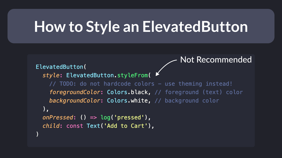
ElevatedButton replaces the old RaisedButton widget in Flutter and its API is different. Here's how to use it:
ElevatedButton(
  style: ElevatedButton.styleFrom(
    // TODO: do not hardcode colors - use theming instead!
    foregroundColor: Colors.black, // foreground (text) color
    backgroundColor: Colors.white, // background color
  ),
  onPressed: () => log('pressed'),
  child: const Text('Add to Cart'),
)
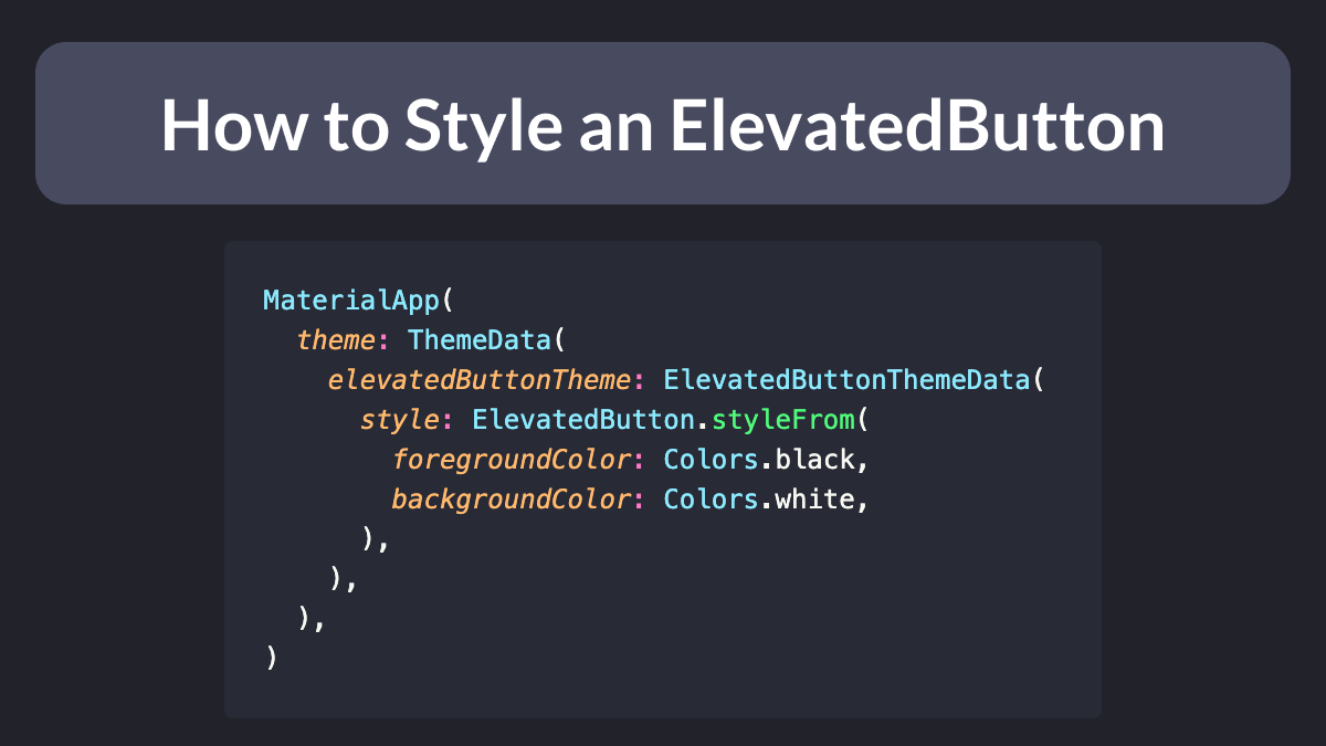
Want to reuse the same style across all ElevatedButtons in your app?
Just set ThemeData.elevatedButtonTheme inside MaterialApp:
MaterialApp(
  theme: ThemeData(
    elevatedButtonTheme: ElevatedButtonThemeData(
      style: ElevatedButton.styleFrom(
        foregroundColor: Colors.black,
        backgroundColor: Colors.white,
      ),
    ),
  ),
)
Of course, ButtonStyle has many properties:
static ButtonStyle styleFrom({
  Color? foregroundColor,
  Color? backgroundColor,
  Color? disabledForegroundColor,
  Color? disabledBackgroundColor,
  Color? shadowColor,
  Color? surfaceTintColor,
  double? elevation,
  TextStyle? textStyle,
  EdgeInsetsGeometry? padding,
  Size? minimumSize,
  Size? fixedSize,
  Size? maximumSize,
  BorderSide? side,
  OutlinedBorder? shape,
  MouseCursor? enabledMouseCursor,
  MouseCursor? disabledMouseCursor,
  VisualDensity? visualDensity,
  MaterialTapTargetSize? tapTargetSize,
  Duration? animationDuration,
  bool? enableFeedback,
  AlignmentGeometry? alignment,
  InteractiveInkFeatureFactory? splashFactory,
})
As usual, the documentation is your friend.
Happy coding!


