Welcome back! This is part 2 of a mini series on how to build a Flight CO2 Calculator in Flutter.
In part 1 we have seen how load the airports data and set up all the non-UI code that will power the app.
This article is all about the widgets and UI. And we will learn how to:
- Use gradients in Flutter.
- Use composition and custom widgets to write reusable and concise UI code.
- Use
CupertinoSegmentedControlfrom the Cupertino widget set.
As we will see, the key message of this article is that:
Creating widgets that are small and reusable favours composition, leading to code that is concise, more performant, and easier to reason about.
But first of all...
A splash of color
I read recently that gradients are back to rule in 2018.
So I wanted to add a vertical gradient to the main screen of the app.
And since this app is about flights, the main colors will be blue and green to represent the sky and the land.
Speaking of colors, I can introduce a palette for the app:
import 'package:flutter/material.dart';

class Palette {
  // background gradient
  static Color blueSky = Color(0xFF068FFA);
  static Color greenLand = Color(0xFF89ED91);

  // card gradient
  static Color blueSkyLight = Color(0x40068FFA);
  static Color greenLandLight = Color(0x4089ED91);

  static Color blueSkyLighter = Color(0x10068FFA);
}
These colors are used to define the gradients for the main page background and the flight details card.
Given a Container widget, a vertical gradient can be configured as follows:
Container(
  decoration: BoxDecoration(
    gradient: LinearGradient(
      begin: Alignment.topCenter,
      end: Alignment.bottomCenter,
      // add additional colors to define a multi-point gradient
      colors: [
        Palette.blueSky,
        Palette.greenLand,
      ],
    ),
  )
);
Simple, but really adds a good splash of color.
Next, we can start building out the visual hierarchy for our app.
Top-level widgets
We can start building the UI by creating a FlightPage:
class FlightPage extends StatelessWidget {

  @override
  Widget build(BuildContext context) {
    return Scaffold(
      appBar: AppBar(
        backgroundColor: Palette.blueSky,
        title: Text('Flight CO2 Calculator'),
      ),
      body: Container(
        decoration: BoxDecoration(
          gradient: LinearGradient(
            begin: Alignment.topCenter,
            end: Alignment.bottomCenter,
            colors: [
              Palette.blueSky,
              Palette.greenLand,
            ],
          ),
        ),
        padding: const EdgeInsets.all(8.0),
        child: SafeArea(
          child: Column(children: <Widget>[
            FlightDetailsCard(),
            FlightCalculationCard(),
          ]),
        ),
      ),
    );
  }
}
FlightDetailsCard and FlightCalculationCard are both stateless widgets which define a Card layout:
class FlightDetailsCard extends StatelessWidget {
  @override
  Widget build(BuildContext context) {
    return Card(
      elevation: 4.0,
      child: Container(
        decoration: BoxDecoration(
          // lighter gradient effect
          gradient: LinearGradient(
            begin: Alignment.topCenter,
            end: Alignment.bottomCenter,
            colors: [
              Palette.blueSkyLight,
              Palette.greenLandLight,
            ],
          ),
        ),
        // TODO: add child
      ),
    );
  }
}

class FlightCalculationCard extends StatelessWidget {
  @override
  Widget build(BuildContext context) {
    return Card(
      elevation: 4.0,
      child: Container(
        // match the ending color of the gradient in FlightDetailsCard
        color: Palette.greenLandLight,
        // TODO: add child
      ),
    );
  }
}
FlightDetailsCard
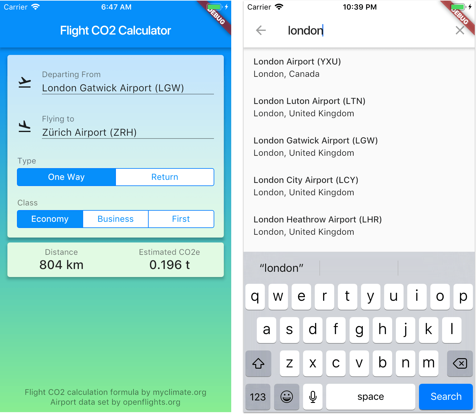
With these top-level widgets in place, we can now look at the full UI for the FlightDetailsCard:
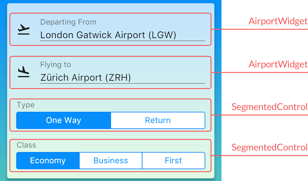
And here, composition and custom widgets are key.
Just as we have created custom widgets for the FlightDetailsCard and the FlightCalculationCard, here we can introduce new AirportWidget and SegmentedControl widgets.
Compared to creating a big widget tree inside one long build method, defining custom widgets will make our code clearer and more reusable.
This approach requires a bit more code initially, but it pays off very quickly.
So let's define our custom widgets.
AirportWidget
This is a custom widget than can be used to launch a Flutter search screen to choose an airport:
import 'package:auto_size_text/auto_size_text.dart';
import 'package:flight_co2_calculator_flutter/airport.dart';
import 'package:flutter/material.dart';

class AirportWidget extends StatelessWidget {
  AirportWidget({this.iconData, this.title, this.airport, this.onPressed});
  /// icon data to use (normally Icons.flight_takeoff or Icons.flight_land)
  final IconData iconData;
  /// Title to show
  final Widget title;
  /// Airport to show
  final Airport airport;
  /// Callback that fires when the user taps on this widget
  final VoidCallback onPressed;
  @override
  Widget build(BuildContext context) {
    final airportDisplayName =
        airport != null ? '${airport.name} (${airport.iata})' : 'Select...';
    return InkWell(
      onTap: onPressed,
      child: Padding(
        padding: EdgeInsets.symmetric(horizontal: 16.0, vertical: 8.0),
        child: Row(
          mainAxisSize: MainAxisSize.max,
          crossAxisAlignment: CrossAxisAlignment.center,
          children: <Widget>[
            Icon(iconData),
            SizedBox(width: 16.0),
            Expanded(
              child: Column(
                crossAxisAlignment: CrossAxisAlignment.start,
                children: <Widget>[
                  title,
                  SizedBox(height: 4.0),
                  AutoSizeText(
                    airportDisplayName,
                    style: TextStyle(fontSize: 16.0),
                    minFontSize: 13.0,
                    maxLines: 2,
                    overflow: TextOverflow.ellipsis,
                  ),
                  Divider(height: 1.0, color: Colors.black87),
                ],
              ),
            ),
          ],
        ),
      ),
    );
  }
}
It defines an onPressed callback via an InkWell widget, which provides a visual hint to the user when it is tapped.
The actual layout is a combination of Row and Column, with SizedBox widgets used for spacing as necessary.
And because the airport display name can overflow into two lines, I'm using a widget called AutoSizeText. This is a custom 3rd party text widget that automatically resizes the text to fit perfectly within its bounds.
SegmentedControl
This is a custom widget built on top of CupertinoSegmentedControl, by adding a header text and some padding.
CupertinoSegmentedControl is used to select between a (small) number of mutually exclusive options. Here I use it to choose the flight type (two options) or the flight class (three options).
I'm not sure if the material design set has something similar to this - so I'm sticking with the Cupertino widget here.
import 'package:flight_co2_calculator_flutter_example/app/constants/palette.dart';
import 'package:flutter/cupertino.dart';

class SegmentedControl<T> extends StatelessWidget {
  SegmentedControl({this.header, this.value, this.children, this.onValueChanged});
  final Widget header;
  final T value;
  final Map<T, Widget> children;
  final ValueChanged<T> onValueChanged;

  @override
  Widget build(BuildContext context) {
    return Column(
      crossAxisAlignment: CrossAxisAlignment.start,
      children: <Widget>[
        Padding(
          padding: EdgeInsets.symmetric(horizontal: 16.0, vertical: 4.0),
          child: header,
        ),
        SizedBox(
          width: double.infinity,
          child: CupertinoSegmentedControl<T>(
            children: children,
            groupValue: value,
            selectedColor: Palette.blueSky,
            pressedColor: Palette.blueSkyLighter,
            onValueChanged: onValueChanged,
          ),
        ),
      ],
    );
  }
}
CupertinoSegmentedControl uses a generic type T, which is used to:
- Define a
Map<T, Widget>of children. - Notify the calling code when a child is selected with a
ValueChanged<T>callback.
Note: Using generics on widget callbacks is a pattern also used when pushing/popping routes with
Navigator, or when showing dialogs.
This makes it easy to configure our SegmentedControl depending on the options we want to show:
final Map<FlightClass, Widget> flightClassChildren =
  const <FlightClass, Widget>{
  FlightClass.economy: Text('Economy'),
  FlightClass.business: Text('Business'),
  FlightClass.first: Text('First'),
};

final Map<FlightType, Widget> flightTypeChildren = const <FlightType, Widget>{
  FlightType.oneWay: Text('One Way'),
  FlightType.twoWays: Text('Return'),
};
With these options, we can update the build method of our FlightDetailsCard:
@override
Widget build(BuildContext context) {
  return Card(
    elevation: 4.0,
    child: Container(
      decoration: BoxDecoration(
        gradient: LinearGradient(
          begin: Alignment.topCenter,
          end: Alignment.bottomCenter,
          colors: [
            Palette.blueSkyLight,
            Palette.greenLandLight,
          ],
        ),
      ),
      child: Column(
        mainAxisSize: MainAxisSize.min,
        children: <Widget>[
          SizedBox(height: 16.0),
          AirportWidget(
            iconData: Icons.flight_takeoff,
            title: Text('Departing From', style: TextStyles.caption),
            airport: flightDetails.departure,
            onPressed: () => print('implement me'),
          ),
          SizedBox(height: 16.0),
          AirportWidget(
            iconData: Icons.flight_land,
            title: Text('Flying to', style: TextStyles.caption),
            airport: flightDetails.arrival,
            onPressed: () => print('implement me'),
          ),
          SizedBox(height: 16.0),
          SegmentedControl<FlightType>(
            header: Text('Type', style: TextStyles.caption),
            value: flightDetails.flightType,
            children: flightTypeChildren,
            onValueChanged: (flightType) => print('implement me'),
          ),
          SizedBox(height: 16.0),
          SegmentedControl<FlightClass>(
            header: Text('Class', style: TextStyles.caption),
            value: flightDetails.flightClass,
            children: flightClassChildren,
            onValueChanged: (flightClass) => print('implement me'),
          ),
          SizedBox(height: 16.0),
        ],
      ),
    ),
  );
}
This method lays out our AirportWidget and SegmentedControl widgets vertically in a Column, with some SizedBox widgets for padding. And excluding the code for the gradient, it is only 35 lines long.
A couple of notes:
- All the callbacks are not doing much at the moment.
- We use a
flightDetailsvariable to configure the values inside ourAirportWidgetandSegmentedControlwidgets.
We will look at data models and how to use the callbacks in details in an upcoming article.
For now, we can complete our UI.
FlightCalculationCard
This is a simple widget that shows two items side by side inside a card. Each item has a title and a value:

We can define our FlightCalculationCard like so:
class FlightCalculationCard extends StatelessWidget {
  FlightCalculationCard({this.flightCalculationData});
  final FlightData flightCalculationData;

  @override
  Widget build(BuildContext context) {
    return Card(
      elevation: 4.0,
      child: Container(
        color: Palette.greenLandLight,
        padding: EdgeInsets.symmetric(vertical: 8.0),
        child: Row(
          children: <Widget>[
            Expanded(
              child: FlightCalculationDataItem(
                title: 'Distance',
                body: flightCalculationData.distanceFormatted,
              ),
            ),
            Expanded(
              child: FlightCalculationDataItem(
                title: 'Estimated CO2e',
                body: flightCalculationData.co2eFormatted,
              ),
            ),
          ],
        ),
      ),
    );
  }
}
To ensure both items share 50% of the horizontal space, we can wrap them inside Expanded widgets in a Row. This works because Expanded has a flex property with a default value of 1, so both widgets will get the same flex.
Our FlightCalculationDataItem is defined like so:
class FlightCalculationDataItem extends StatelessWidget {
  FlightCalculationDataItem({this.title, this.body});
  final String title;
  final String body;

  @override
  Widget build(BuildContext context) {
    return Column(
      crossAxisAlignment: CrossAxisAlignment.center,
      children: [
        Text(
          title,
          style: TextStyles.caption,
        ),
        Text(
          body,
          style: TextStyle(
            fontSize: 20.0,
            fontWeight: FontWeight.w500,
            color: Colors.black87,
          ),
        ),
      ],
    );
  }
}
Once again, here I'm striving to define simple and small widget classes, as a way to reusing code and promoting composition.
Wrap up
To repeat what I said at the beginning:
Creating widgets that are small and reusable favours composition, leading to code that is concise, more performant, and easier to reason about.
When building UIs, you may wonder when it is appropriate to break things up and create custom classes. Here is my rule of thumb:
Every time I build a new feature or page in Flutter, I always ask myself which logical UI components are needed, and build them as custom widgets.
One easy way to identify logical UI components, is to see if they are used more than once.
One more thing
In the build method of the FlightDetailsCard there are five instances of SizedBox(height: 16.0).
To improve readability, we could even define a new class:
class VerticalSpacing extends SizedBox {
  VerticalSpacing({double height = 16.0}) : super(height: height);
}
By using this, we can change this code:
<Widget>[
  SizedBox(height: 16.0),
  AirportWidget(
    // parameters
  ),
  SizedBox(height: 16.0),
  AirportWidget(
    // parameters
  ),
  SizedBox(height: 16.0),
  SegmentedControl<FlightType>(
    // parameters
  ),
  SizedBox(height: 16.0),
  SegmentedControl<FlightClass>(
    // parameters
  ),
  SizedBox(height: 16.0),
]
to this:
<Widget>[
  VerticalSpacing(),
  AirportWidget(
    // parameters
  ),
  VerticalSpacing(),
  AirportWidget(
    // parameters
  ),
  VerticalSpacing(),
  SegmentedControl<FlightType>(
    // parameters
  ),
  VerticalSpacing(),
  SegmentedControl<FlightClass>(
    // parameters
  ),
  VerticalSpacing(),
]
While this doesn't reduce the number of lines, the intent behind the code is a lot clearer.
As someone once said:
Programs are meant to be read by humans and only incidentally for computers to execute. -- Donald Knuth
Final note on naming things
When we decide to create new widgets, we need to give them a name. As it turns out:
There are only two hard things in Computer Science: cache invalidation and naming things. -- Phil Karlton
On the topic of naming things, I highly recommend this page about API Design Guidelines. While it is specific for the Swift language, most of the guidelines work well in any language.
That's it for today. In the next article I'll show how to build the Flutter Search screen to lookup airports from our data-set.
The updated source code for this app is available here on GitHub. 🙏
Happy coding!

