Ever needed to use a TextField and validate the text on the fly as the user types?
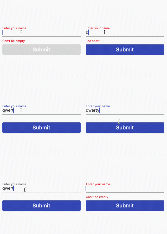
In this example, we show a custom error hint and disable the submit button if the text is empty or too short.
If you wanted to implement this functionality in Flutter, how would you do it?
People on StackOverflow seem to have many opinions about it, and indeed there are two main ways of doing this:
- Use a
TextFieldwith aTextEditingControllerand aValueListenableBuilderto update the UI. - Use a
Formand aTextFormFieldalong with aGlobalKeyto validate and save the text field data.
In this article, we'll explore both solutions so you can learn how to work with text input in Flutter.
1. Flutter TextField Validation with TextEditingController
To get started, let's build the basic UI first.
Basic UI with TextField and ElevatedButton
Step one is to create a StatefulWidget subclass that will contain both our TextField and the submit button:
class TextSubmitWidget extends StatefulWidget {
  const TextSubmitWidget({Key? key, required this.onSubmit}) : super(key: key);
  final ValueChanged<String> onSubmit;

  @override
  State<TextSubmitWidget> createState() => _TextSubmitWidgetState();
}
Note how we added an
onSubmitcallback. We will use this to inform the parent widget when the user presses the "Submit" button upon entering a valid text.
Next, let's create the State subclass:
class _TextSubmitWidgetState extends State<TextSubmitWidget> {
  @override
  Widget build(BuildContext context) {
    return Column(
      mainAxisSize: MainAxisSize.min,
      crossAxisAlignment: CrossAxisAlignment.stretch,
      children: [
        TextField(
          decoration: InputDecoration(
            labelText: 'Enter your name',
            // TODO: add errorHint
          ),
        ),
        ElevatedButton(
          // TODO: implement callback
          onPressed: () {},
          child: Text(
            'Submit',
            style: Theme.of(context).textTheme.headline6,
          ),
        )
      ],
    );
  }
}
This is a simple Column layout that contains a TextField and an ElevatedButton.
If we run this code inside a single-page Flutter app, both the text field and the submit button will show:

Next, we want to add all the validation logic and update the UI according to these rules:
- if the text is empty, disable the submit button and show
Can't be emptyas an error hint - if the text is not empty but too short, enable the submit button and show
Too shortas an error hint - if the text is long enough, enable the submit button and remove the error hint
Let's figure out how to implement this.
Adding a TextEditingController
Flutter gives us a TextEditingController class that we can use to control our text field.
So let's use it. All we have to do is to create it inside the State subclass:
class _TextSubmitWidgetState extends State<TextSubmitWidget> {
  // create a TextEditingController
  final _controller = TextEditingController();

  // dispose it when the widget is unmounted
  @override
  void dispose() {
    _controller.dispose();
    super.dispose();
  }

  ...
}
And then we can pass it to our TextField:
TextField(
  // use this to control the text field
  controller: _controller,
  decoration: InputDecoration(
    labelText: 'Enter your name',
  ),
),
We can also add a getter variable to control the _errorText that we pass to the TextField:
String? get _errorText {
  // at any time, we can get the text from _controller.value.text
  final text = _controller.value.text;
  // Note: you can do your own custom validation here
  // Move this logic this outside the widget for more testable code
  if (text.isEmpty) {
    return 'Can\'t be empty';
  }
  if (text.length < 4) {
    return 'Too short';
  }
  // return null if the text is valid
  return null;
}

// then, in the build method:
TextField(
  controller: _controller,
  decoration: InputDecoration(
    labelText: 'Enter your name',
    // use the getter variable defined above
    errorText: _errorText,
  ),
),
With this in place, we can add some custom logic to the onPressed callback inside our button:
ElevatedButton(
  // only enable the button if the text is not empty
  onPressed: _controller.value.text.isNotEmpty
      ? _submit
      : null,
  child: Text(
    'Submit',
    style: Theme.of(context).textTheme.headline6,
  ),
)
Note how we call a _submit method if the text is not empty. This is defined as follows:
void _submit() {
  // if there is no error text
  if (_errorText == null) {
    // notify the parent widget via the onSubmit callback
    widget.onSubmit(_controller.value.text);
  }
}
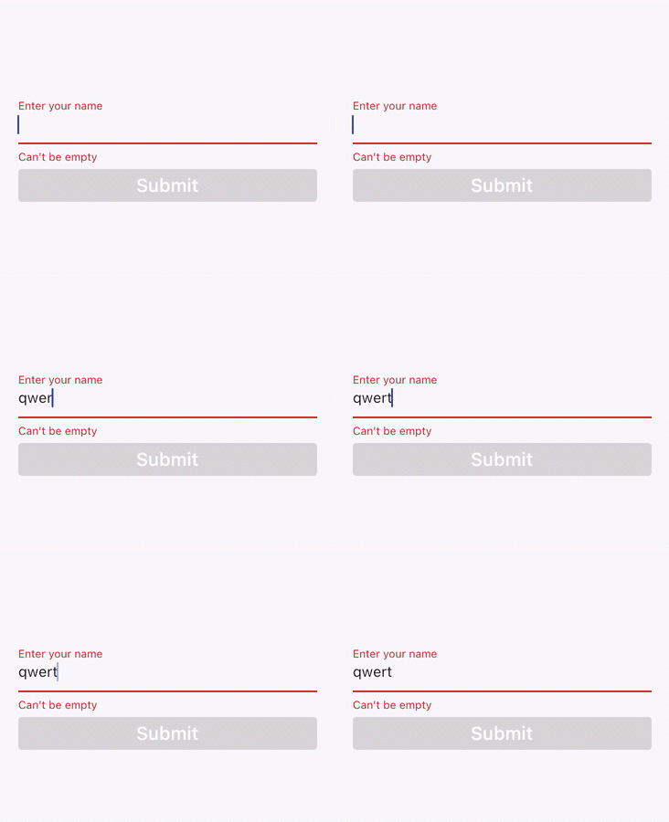
But if we run this code, the TextField always shows the error text and the submit button remains disabled even if we enter a valid text:
What's the deal? 🧐
Widget rebuilds and setState()
The problem is that we are not telling Flutter to rebuild our widget when the text changes.
We could fix this by adding a local state variable and updating it with a call to setState() inside the onChanged callback of our TextField:
// In the state class
var _text = '';

// inside the build method:
TextField(
  controller: _controller,
  decoration: InputDecoration(
    labelText: 'Enter your name',
    errorText: errorText,
  ),
  // this will cause the widget to rebuild whenever the text changes
  onChanged: (text) => setState(() => _text),
),
With this change our UI updates on the fly and behaves as expected:

But a local state variable is not necessary because our TextEditingController already holds the text value as it changes.
As a proof of this, we could make an empty call to setState() and everything would still work:
onChanged: (_) => setState(() {}),
But forcing a widget rebuild like this seems a bit of an anti-pattern. There must be a better way.
How to use TextEditingController with ValueListenableBuilder
As it turns out, we can wrap our widget tree with a ValueListenableBuilder that takes our TextEditingController as an argument:
@override
Widget build(BuildContext context) {
  return ValueListenableBuilder(
    // Note: pass _controller to the animation argument
    valueListenable: _controller,
    builder: (context, TextEditingValue value, __) {
      // this entire widget tree will rebuild every time
      // the controller value changes
      return Column(
        mainAxisSize: MainAxisSize.min,
        crossAxisAlignment: CrossAxisAlignment.stretch,
        children: [
          TextField(
            controller: _controller,
            decoration: InputDecoration(
              labelText: 'Enter your name',
              errorText: _errorText,
            ),
          ),
          ElevatedButton(
            onPressed: _controller.value.text.isNotEmpty
                ? _submit
                : null,
            child: Text(
              'Submit',
              style: Theme.of(context).textTheme.headline6,
            ),
          )
        ],
      );
    },
  );
}
As a result, both the TextField and ElevatedButton will rebuild when the text changes:

But why are we allowed to pass our TextEditingController to the ValueListenableBuilder?
ValueListenableBuilder(
  // this is valid because TextEditingController implements Listenable
  valueListenable: _controller,
  builder: (context, TextEditingValue value, __) { ... }
)
Well, ValueListenableBuilder takes an argument of type ValueListenable<T>.
And TextEditingController extends ValueNotifier<TextEditingValue>, which implements ValueListenable<ValueListenable>. This is how these classes are defined in the Flutter SDK:
class TextEditingController extends ValueNotifier<TextEditingValue> { ... }
class ValueNotifier<T> extends ChangeNotifier implements ValueListenable<T> { ... }
So here we have it. We can use ValueListenableBuilder to rebuild our UI when the TextEditingController value changes. 👍
Note about the validation UX
The example above works but has one drawback: we are showing a validation error right away before the user has the chance to enter any text.

This is not good UX. It would be better to only show any errors after the text has been submitted.
We can fix this by adding a _submitted state variable that is only set to true when the submit button is pressed:
class _TextSubmitWidgetState extends State<TextSubmitWidget> {
  bool _submitted = false;

  void _submit() {
    setState(() => _submitted = true);
    if (_errorText == null) {
      widget.onSubmit(_controller.value.text);
    }
  }

  ...
}
Then, we can use it to conditionally show the error text:
TextField(
  controller: _controller,
  decoration: InputDecoration(
    labelText: 'Enter your name',
    // only show the error text if the form was submitted
    errorText: _submitted ? _errorText : null,
  ),
)
And with this change in place, the error text only shows after we submit the form:
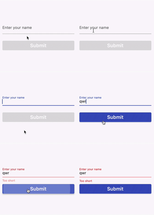
Much better.
Flutter TextField Validation with TextEditingController: Summary
Here are the key points we covered so far:
- When we work with text input, we can use
TextEditingControllerto get the value of aTextField. - If we want our widgets to rebuild when the text changes, we can wrap them with a
ValueListenableBuilderthat takes theTextEditingControlleras an argument.
This works, but it is a bit tricky to set up. Wouldn't it be nice if we could use some high-level APIs to manage form validation?
That's exactly what the Form and TextFormField widgets are for.
So let's figure out how to use them by implementing the same solution with a form.
2. Flutter Form Validation with TextFormField
Here's an alternative implementation of the _TextSubmitWidgetState that uses a Form:
class _TextSubmitWidgetState extends State<TextSubmitForm> {
  // declare a GlobalKey
  final _formKey = GlobalKey<FormState>();
  // declare a variable to keep track of the input text
  String _name = '';

  void _submit() {
    // validate all the form fields
    if (_formKey.currentState!.validate()) {
      // on success, notify the parent widget
      widget.onSubmit(_name);
    }
  }

  @override
  Widget build(BuildContext context) {
    // build a Form widget using the _formKey created above.
    return Form(
      key: _formKey,
      child: Column(
        mainAxisSize: MainAxisSize.min,
        crossAxisAlignment: CrossAxisAlignment.stretch,
        children: [
          TextFormField(
            decoration: const InputDecoration(
              labelText: 'Enter your name',
            ),
            // use the validator to return an error string (or null) based on the input text
            validator: (text) {
              if (text == null || text.isEmpty) {
                return 'Can\'t be empty';
              }
              if (text.length < 4) {
                return 'Too short';
              }
              return null;
            },
            // update the state variable when the text changes
            onChanged: (text) => setState(() => _name = text),
          ),
          ElevatedButton(
            // only enable the button if the text is not empty
            onPressed: _name.isNotEmpty ? _submit : null,
            child: Text(
              'Submit',
              style: Theme.of(context).textTheme.headline6,
            ),
          ),
        ],
      ),
    );
  }
}
Here's how the code above works:
- We declare a
GlobalKeythat we can use to access the form state and pass it as an argument to theFormwidget. - We use a
TextFormFieldrather than aTextField. - This takes a
validatorfunction argument that we can use to specify our validation logic. - We use a separate
_namestate variable and update it in theonChangedcallback of theTextFormFieldwidget (note how this is used in theonPressedcallback of theElevatedButton). - Inside the
_submit()method, we call_formKey.currentState!.validate()to validate all the form data. If this is successful, we notify the parent widget by callingwidget.onSubmit(_name).
The Flutter FormState class gives us validate and save methods that make it easier to manage the form data.
AutovalidateMode
To decide when the TextFormField validation takes place, we can pass an autovalidateMode argument. This is an enum defined as follows:
/// Used to configure the auto validation of [FormField] and [Form] widgets.
enum AutovalidateMode {
  /// No auto validation will occur.
  disabled,

  /// Used to auto-validate [Form] and [FormField] even without user interaction.
  always,

  /// Used to auto-validate [Form] and [FormField] only after each user
  /// interaction.
  onUserInteraction,
}
By default, AutovalidateMode.disabled is used.
We could change this to AutovalidateMode.onUserInteraction so that our TextFormField validates when the text changes:
TextFormField(
  decoration: const InputDecoration(
    labelText: 'Enter your name',
  ),
  // validate after each user interaction
  autovalidateMode: AutovalidateMode.onUserInteraction,
  // The validator receives the text that the user has entered.
  validator: (text) {
    if (text == null || text.isEmpty) {
      return 'Can\'t be empty';
    }
    if (text.length < 4) {
      return 'Too short';
    }
    return null;
  },
)
But as we said before, we only want to enable validation after the form has been submitted.
So let's add a _submitted variable like we did before:
class _TextSubmitFormState extends State<TextSubmitForm> {
  final _formKey = GlobalKey<FormState>();
  String _name = '';
  // use this to keep track of when the form is submitted
  bool _submitted = false;

  void _submit() {
    // set this variable to true when we try to submit
    setState(() => _submitted = true);
    if (_formKey.currentState!.validate()) {
      _formKey.currentState!.save();
      widget.onSubmit(_name);
    }
  }
}
Then, inside the TextFormField we can do this:
TextFormField(
  autovalidateMode: _submitted
      ? AutovalidateMode.onUserInteraction
      : AutovalidateMode.disabled,
)
The end result is exactly what we want: the error hint only shows after we submit the form if the text is invalid:

Conclusion
We have now explored two different ways of validating a form in Flutter.
You can find the complete source code and play with both solutions on Dartpad:
Which one should you use?
I recommend using Form and TextFormField, as they give you some high-level APIs that make it easier to work text input, and they are better suited if you have multiple form fields on the same page.
With that said, TextEditingController gives you more fine-grained control and lets you get and set the text, which can be handy when you need to pre-fill a text field. You can find more details in the TextEditingController documentation.
And if you want to learn more about working with forms, check the official documentation on Flutter.dev.
Happy coding!


